Make options more discoverable (UX - provide affordance) #21
Description
I've been going through the Starling GateSeq tutorials in detail. I'm trying to understand these cryptic modules a bit more. I've come a long way in the past couple years with a variety of modules and techniques (thanks to the many great tutorials our group supplies). I always like learning new things, and can never know everything of course.
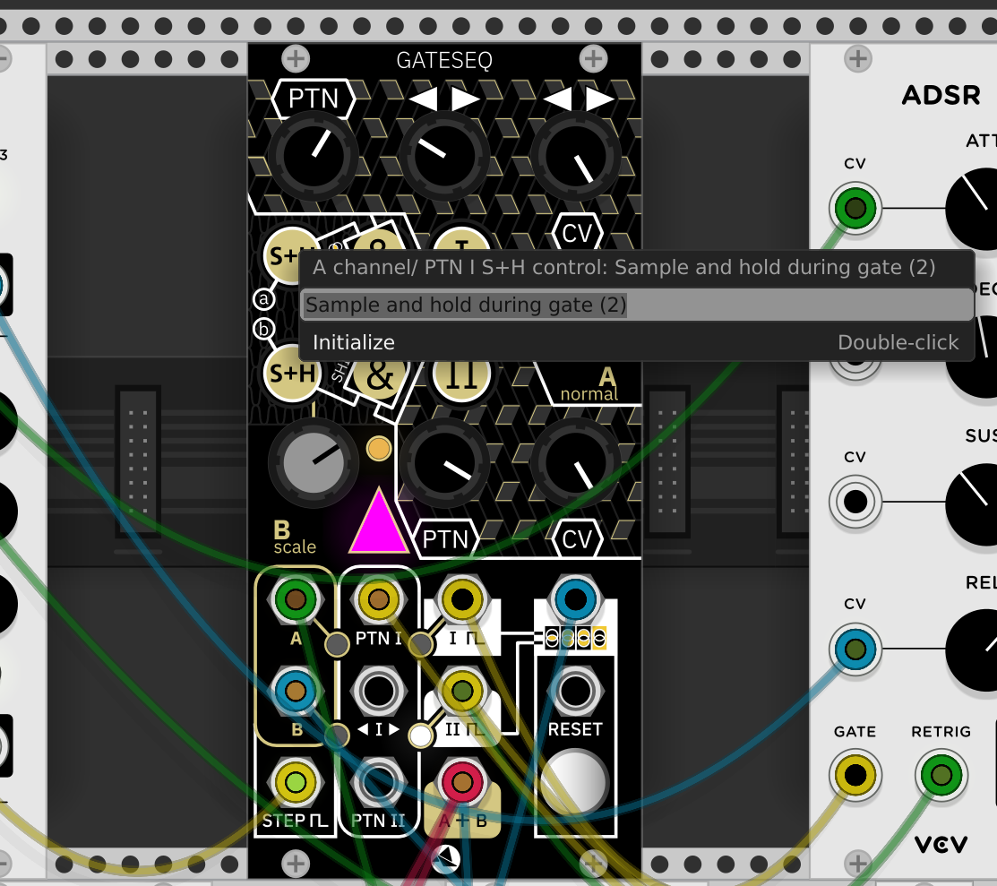
I just find the interface very distracting on these Starling modules, and so many options are hidden under the hood under CTRL+Click. Wouldn't it be better to put more of those options in a menu, rather than "under" a CTRL+Click? Or at least make it more obvious that the options are there?
This is an issue with a number of modules, but in this case it really impacted any enjoyment of using the modules themselves, and got in the way of the flow of the creative process.